I just finished reading the new book on data science called Fundamentals of Data Visualization by Claus Wilke. When I say reading I mean going and drill down on the topics that interests me. You cannot really never end this kind of book; it is a perennial. We are so fortunate that we can enjoy a book of this quality.
Although the book has been written in R with Rmarkdown and the graphics generated with the package ggplot2, among others, the book is not about R; it is about data visualization. Or, a guide on to achieve great data visualization.
Here is the cover of the book in Amazon. It is scheduled to be released on December 8, 2018.
Link: https://www.amazon.com/Fundamentals-Data-Visualization-Informative-Compelling/dp/1492031089
I got news of the book in Twitter few months ago. It caught my eye because the book impressively designed, was written purely in Rmarkdown. To be honest, I had no idea that you could achieve publishing quality with Rmarkdown and ggplot2. Well, here is the proof.
If we leave aside R for a moment, the great accomplishment of the book is putting together the best practices of data visualization in one corpus, totally oriented to data science.
Best practices in data visualization
Where do I start? The book is so rich that it would take me days to describe it all. What I will do is reviewing the parts I was most interest in. This is my short list, which by the way is really short compared with the 24 chapters in this book.
The right plot for the right data
Putting coordinates at good use
Handling overlapping
Managing the data-ink ratio
3D plotting is not the answer
Plots are about telling a story
The Good, the Bad, and the Ugly. Plus the Wrong
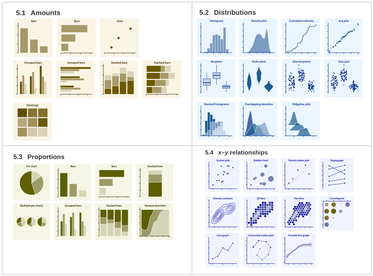
The right plot for the right data
I have seen in the books and the web various efforts of categorization of plots for presenting data but I haven’t found something as compelling as this directory of visualizations. It will quickly point you in the right direction. All of the examples in the directory are plots created with ggplot2 and real data. None of them have been hand drawn.
Here is the piece of code for the 2D bins plot:
# codecodeLet’s just remember the code was not in the spirit of the book; I am just showing the code to satisfy yours and my curiosity. Please, don’t tell Claus Wilke that I am showing R code here.
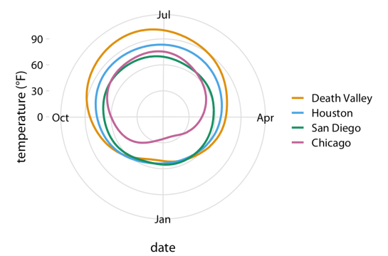
Putting coordinates at good use
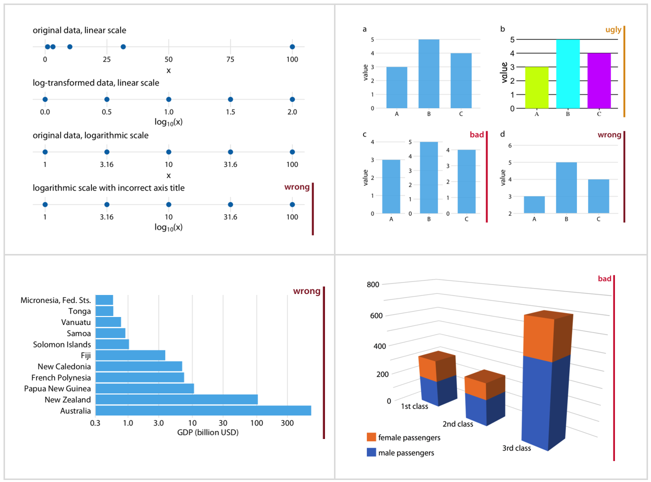
With something so simple as the cartesian coordinates we are always manage to make silly mistakes: labeling wrong a logarithmic scale, applying the wrong transformation, or lacking the practice for a polar coordinate plot. Or what about plotting geospatial data? With few examples Claus Wilke makes it clear and simple. My favorite example is the temperature round the year in different places in polar coordinates.
And the code is:
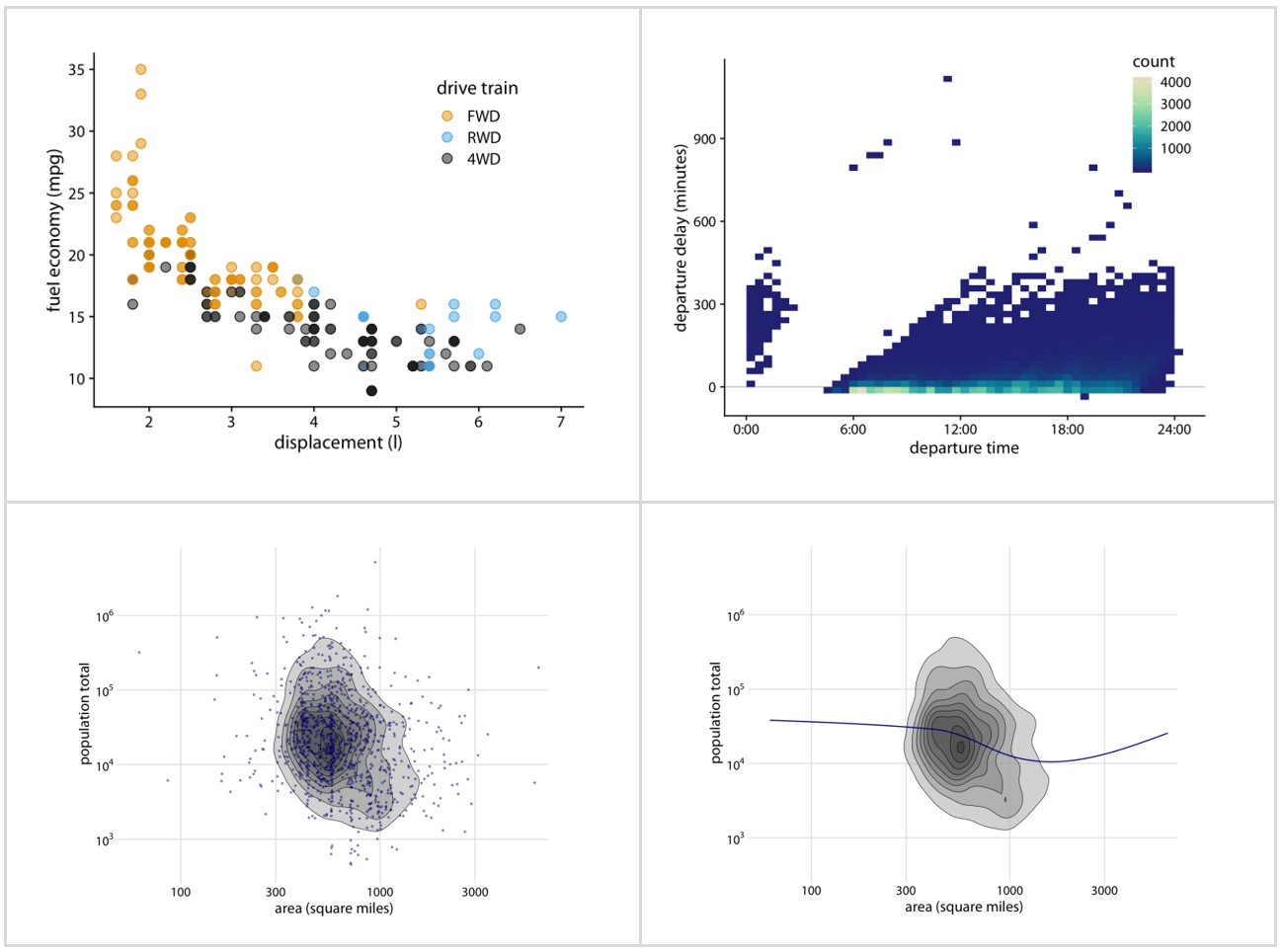
insert codeHandling overlapping
This is one is something we deal every day, having to handle overlapping points. The author offers several solutions to this problem: partial transparency, jittering, both managed with careful selection of color and shading; binning data into rectangles and hexagons, using contour lines with shading when we deal with high density points.
Managing the data-ink ratio
Optimizing ink that goes into non-data visual elements comes from Edward Tufte. And requires a balancing act when not to too far. See with the examples from Wilke’s book what I mean by that. On the left we have too much ink for the grids, the legend and the frame. On the right we have too little; no grids, no frame which makes the plot confusing.
3D plotting is not the answer
We all have fell for this. We love 3D. It impresses everybody. But the question is, are we conveying the message that the data is carrying? Is a 3D plot the right choice? Isn’t the data being distorted or more difficult to read? See for yourself.
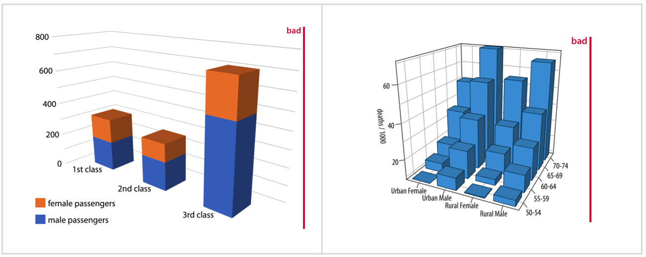
The author goes as far as saying that “3D It is unequivocally bad and should be erased from the visual vocabulary of data scientists.”
Plots are about telling a story
I loved this part. What’s your format for sharing your discoveries from a dataset? Opening–Challenge–Action–Resolution? Lead–Development–Resolution? Action–Background–Development–Climax–Ending? Or just Lead–Development? The author borrows from the storytelling patterns of writers to tell a story to apply it in data science. Pretty smart. Regularly, we follow our instincts to frame how we engage with the audience and narrate the challenge and the findings. And many times, we don’t do it in articulate fashion. Here is where Wilke shares his experience to make the point. It comes to this:
How do you plan to tell the story? Borrow from the writers storytelling techniques.
What figures will you use to tell the story? Select the figures that adjust to your scene setting. Will a figure explain the question and the discoveries?
Make a figure for the generals. People who take decisions are always busy. Simplify your figures to show the patterns that you see. Sophistication provided by modern tools may get in your way with figures difficult to digest or understand.
Build up towards complex figures. Come up with a multiple facet figure and everybody is scratching their heads to comprehend? What about coming first with a portion of it first? A subset.
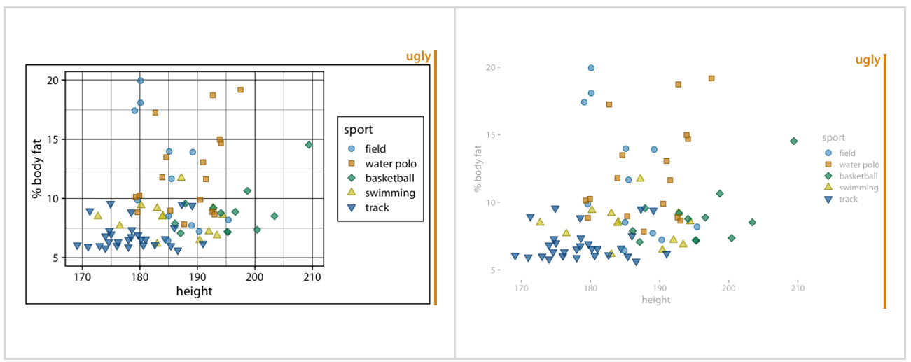
The Good, the Bad, the Ugly, and the Wrong
Paraphrasing the Clint Eastwood’s spaghetti western The Good, the Bad and the Ugly, the author in his book helps us to identify when a plot lacks a proper design, incorrect formatting, or faulty settings. It will not let you guessing from the text in the book; it will explicitly tell what not to do. The author later explains in the caption why the plot was categorized as that.
A book built with Rmarkdown
As I mentioned before, the author decided not to do this book about code. But impressed as I was from the moment I saw the draft months ago, I peaked inside. I looked under the hood. Every chapter is written in Rmarkdown, uses several libraries and datasets to illustrate the visualization techniques. The code content by itself can teach how to build the right figure. At the time I was also embarked in learning Docker containers to make data science reproducible. So, I decided to clone the repository in GitHub and build the book from the code provided.
In fact, you don’t need to do this since the book is available online at http://serialmentor.com/dataviz. The website was generated by the R package bookdown.
The purpose of building a Docker container is providing all the required packages and operating system libraries so the building process is repeatable and successful every time.
The Docker container
I will not describe the step-by-step process to build the container; it would make this article long when topic at point is data visualization. I will tell you how to get it and run it.
The Docker container can be pulled from this repository https://hub.docker.com/r/f0nzie/clauswilke.dataviz.2018/ at Docker Hub.
Here is a short summary to install the container in your PC:
- Install Docker Toolbox
- Test it with a basic “Hello World” example.
- Pull the container with:
docker pull f0nzie/clauswilke.dataviz.2018Run it with:
docker run --rm -p 58787:8787 -e PASSWORD=oilgains f0nzie/clauswilke.dataviz.2018:latestThe last line will give you the RStudio web IDE.
Enter the username rstudio and password oilgains to login to RStudio.
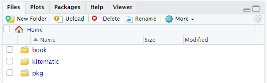
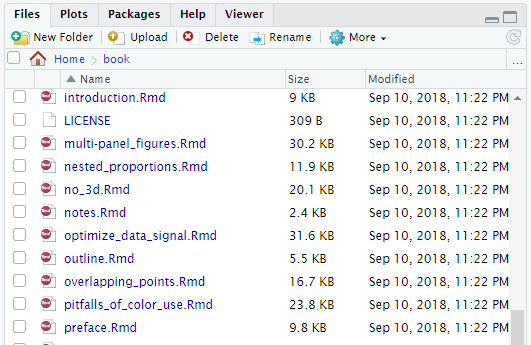
Click on the folder book. See figure below:
Click on the project dataviz.Rproj to open the project.

Click on the tab terminal
Write this in the terminal:
sh _build_final.shPress <enter>.
The book will start to build.
To see the code that gives origin to all the plots in the book, just browse in the same folder for any of the Rmd files. Here are some of them:
You will have a great learning experience by looking at the plots in the book and seeing the code in the Docker container.
There are many more things to learn from this container. For example, how to build a book with bookdown. But that a matter for another article.